
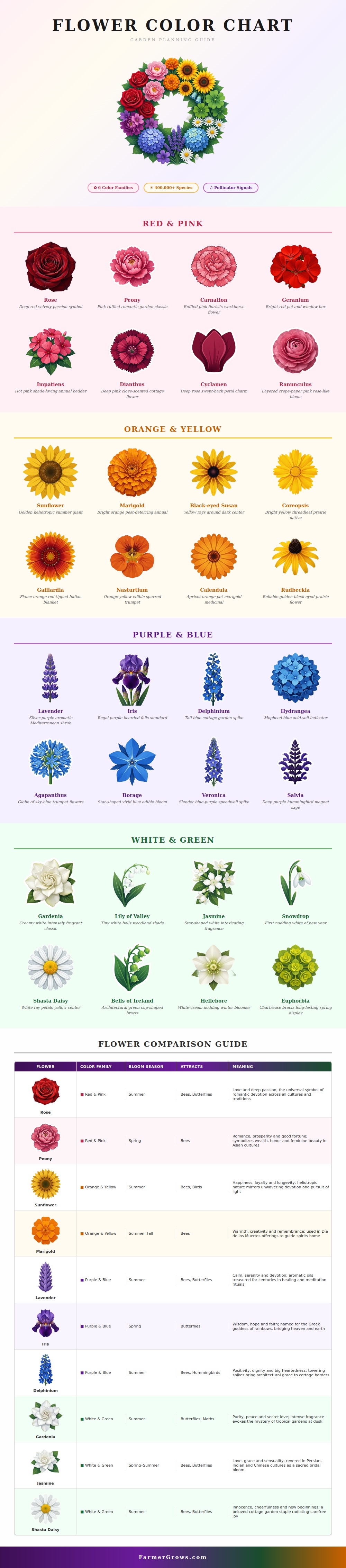
The first thing your eye sees in a garden is color. Before using our other senses to connect with a place, color establish the mood. If it is treated as an afterthought, the space feel cluttered. Treated as a foundation and even a little goes a long way toward curating even a small space. More often it’s not a matter of enthusiasm but visual strategy.
Color is like a painter’s palette. It’s how the smart gardener thinks about flower color: not grouping them by bloom time, but rather by their emotional effect, like an artist works with pigments. That’s how the visual guide breaks it down into six distinct color families. This make it easier to plant without guessing. First, you decide which emotion you want the space to evoke. Then you make your color choices before you even touch soil.
How to Use Color in Your Garden
Make strong statements. Pink and red blooms shout out for attention. Peonies and roses say passion. But it’s important to place them on purpose. Bright red geraniums are best used in a bed where there is a plan. Scatter them around haphazardly, and they will appear messy. Group them closely together, and suddenly they seems part of an intentional design. Deep reds suggest energy and urgency. Use red to lead your eye to a focal point (such as a bench or gate), or to anchor something in place.
And then there’s the warm colors: Yellow and orange flowers enliven the landscape. These are cheerful sunflowers and marigolds. Loud and lively color, good for parts of the garden where you’d like to invite action or even an edible one. As the chart indicates, they’re appealing to birds and bees as well. High-contrast images draw insects; plant nasturtiums or coreopsis, and you say welcome to pollinators. And the warmth connects with our collective cultural memories, too. Marigolds figure in Day of the Dead altars, guiding the spirit (and the eye).
Blue and purple flowers slow down the eye. Delphinium and lavender brings a sense of calm. These are recession colors. They help make a small garden feel bigger; they literal recede from view. Lean into blues if you have a tight urban space. Salvia and agapanthus adds height but don’t feel aggressive. These are good for borders where you want a soft edge. Lavender engages not just one but two senses with its fragrant quality.
Remember green and white. Shasta daisies and gardenias give your eyes a rest. It is the white space in the overall design. A colorful garden without them can be exhausting. White will highlight the texture of nearby plants and reflect light. The green foliage ground the softness of the blooms. It provides structure. Mix those cooler neutrals with the hotter colors for balance, this avoids the cluttered look common to so many new gardens.
Begin with basics. Select a main color scheme and add an accent of two colors. Refer back to the chart for ideas on what would of worked well together. After all, there’s no need to grow every color in the rainbow to make a good garden. Just ones that work together. More isn’t always better; sometimes fewer flower are better because you have the right ones. And your garden will be a peaceful, intentional place.